Florida Firearms Academy: three homepage directions
Read the website report · Download the PDF
Three complete 19-page sites with the same copy, SEO, booking demo and fixes. Only the look changes. A is the build: their current site brought up to standard. B and C are alternate variants. Scroll inside each preview (left: desktop, right: phone) or open the full site. Prepared by Di-Hy Digital, 2026-11-11. Not the live site.
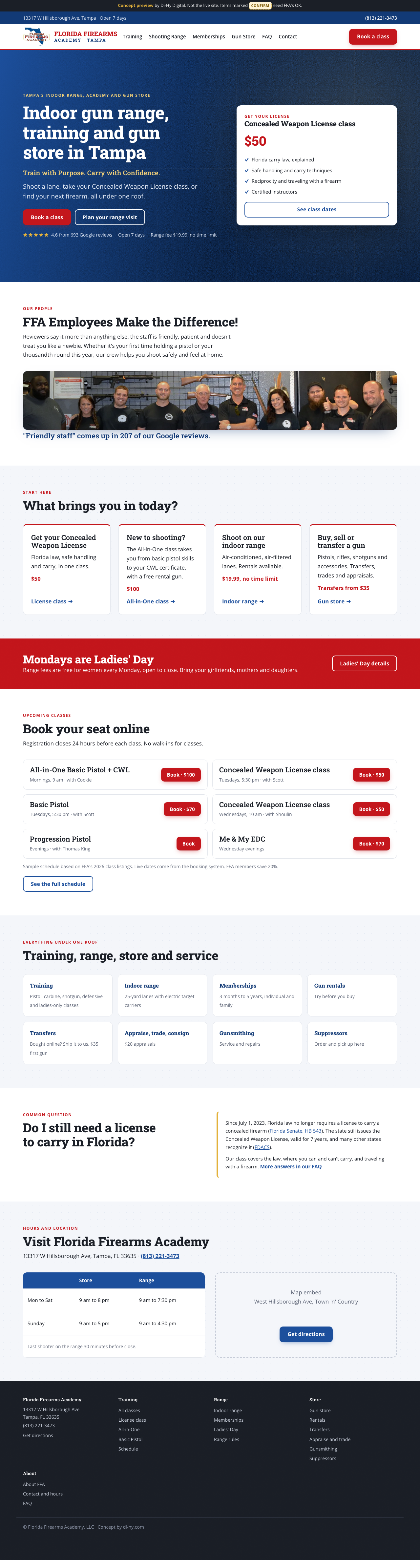
A · The build (faithful)
Refined FFA
- Colors come straight from their logo: Florida blue, red, gold
- Slab serif headings echo the logo lettering; Open Sans body (their current font)
- The one they'll recognize instantly. Lowest-risk pitch
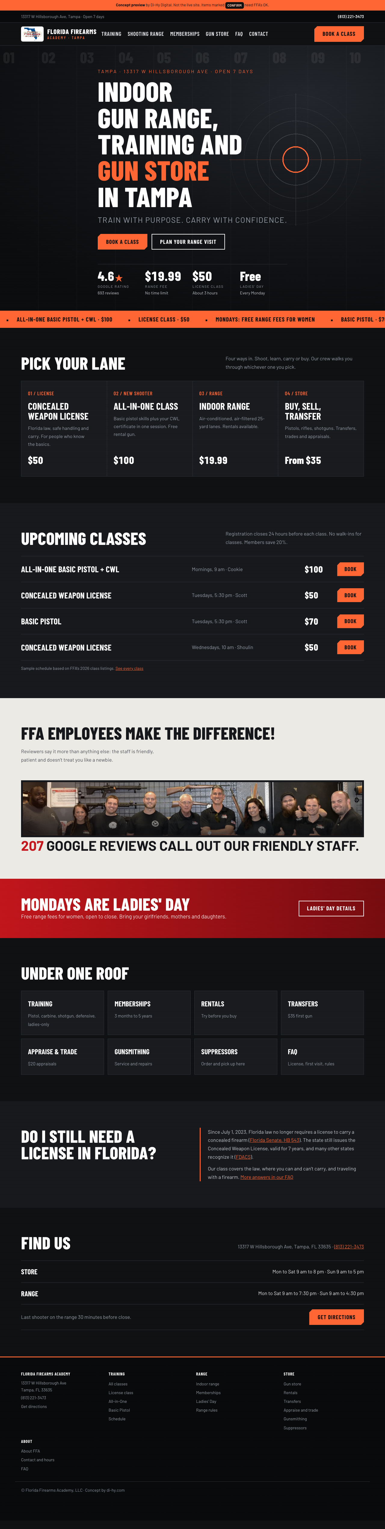
B · Variant (drastic)
Range Day
- Dark, industrial, bold condensed type, lane numbers and a target motif
- Keeps their web orange (#ff6633) as the accent; grain texture on dark sections
- Feels like a modern range brand. Strong for regulars and competition shooters
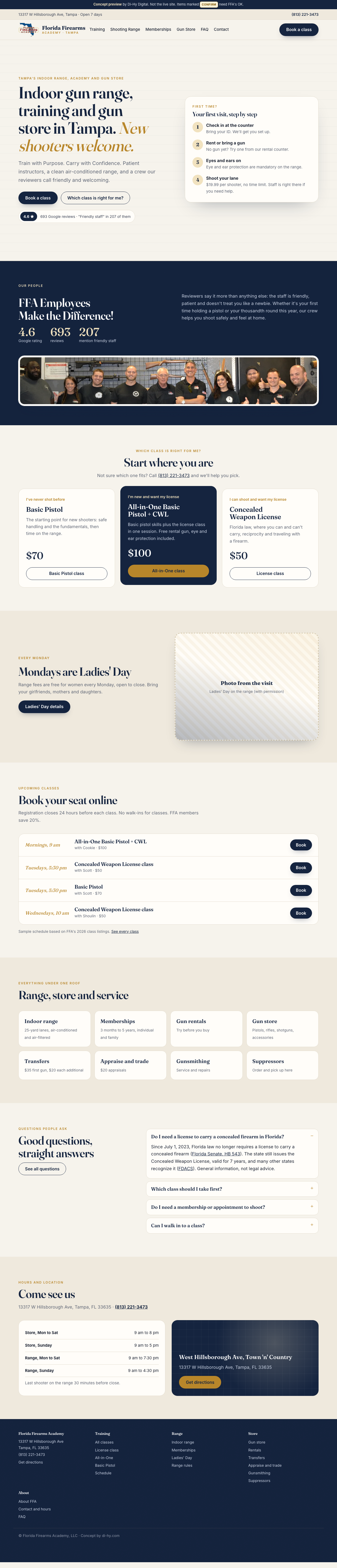
C · Variant (different)
The Academy
- Calm, editorial, trust-led: serif headlines, warm paper tones, navy from the logo
- Built around first-timers: "first visit, step by step", a class chooser, FAQ on the homepage
- Best match for the review data (friendly staff) and the Ladies' Day audience
Same in all three
- Copy from the copy pass: their own lines kept ("Train with Purpose. Carry with Confidence.", "FFA Employees Make the Difference!")
- One H1, sticky Call and Book bar on phones, no sideways scroll at 360px, 375px or 1280px
- Booking buttons that work, prices up front, the license question answered with sources
- Logo cut out of its white box with a mobile wordmark lockup and favicons. A true vector waits on their original file
- Photos: their staff photo runs through each site's signature overlay. Labeled slots wait on the visit shot list